I am presenting three Real Estate statistics to help you ANTICIPATE where the price of Calgary Real Estate may trend. I am also sharing with you my CMD Rate Barometer. This clearly displays the spread between bond yields and interest rates. This image helps you ANTICIPATE where fixed interest rates may trend.
Please read below about each statistic. Please also share this post with others who you think may find this interesting.
If you have any questions or concerns, please contact me at 403-809-5447 or chad@canadamortgagedirect.com
Thank you!
Chad Moore
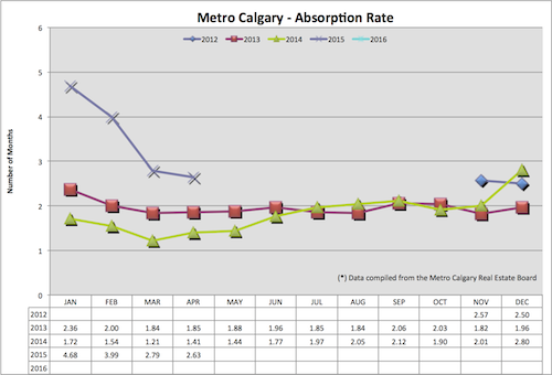
Absorption Rate:
The statistic calculates, in months, how long it would take to sell the current level of inventory at the pace of sales for that same month. This indicates the relationship between supply of homes in Calgary and the pace of sales.
Our absorption rate is seasonally decreasing month over month, but is quite high relative to April 2014. This is due to more listings and less sales year over year. Traditionally, a “balanced market” is between 2-4 months.
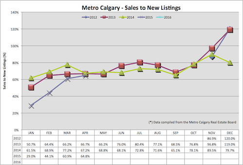
Sales To New Listings Ratio:
This ratio is found by dividing the number of sales by the number of new listings added to the market. This is an indicator of how many new listings are added to the market, net of all new sales for each particular month.
If this ratio is quite low, we are slowly growing our overall listing inventory. Naturally, home prices are greatly influenced by the law of supply and demand. Increasing supply, without an equal increase of demand, has a lagging downward effect on home prices.
Our sales to new listings ratio is virtually the same for the past two years at 65%. I think this is relatively positive news for our housing market.
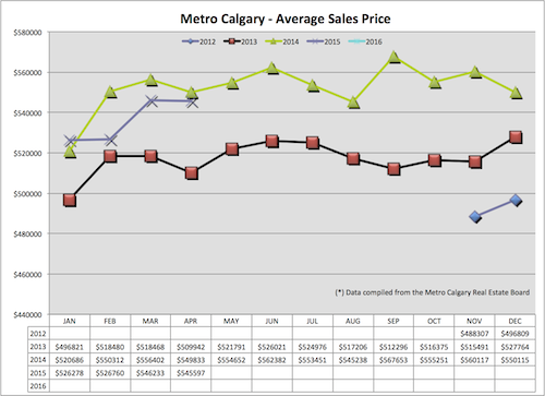
Average Sales Price:
This number is found by adding all of the sales prices of single family detached homes sold and dividing them by the number of homes sold. This gives us a general sense of where the price of homes are month over month and year over year.
For April 2015 we are virtually flat month over month and down several percentage points year over year.
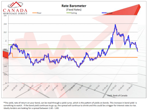
Rate Barometer:
The blue line in this graph is the spread between bond yields and interest rates. A downward trend of the spread indicates less money being made by Banks. We all know, Banks LOVE to make money. When the spread is too small, for their comfort, they increase interest rates to increase their spread again. The horizontal green and orange lines are the “comfort zone” of most lenders. You notice lately, there is a decreasing spread which helps us ANTICIPATE a greater threat of increasing interest rates.
Thank you for reading. If you have any questions or comments, please direct them to 403-809-5447 or chad@canadamortgagedirect.com.