Below are several key data points to help you anticipate the price of Calgary Real Estate in the coming months:
- Sales to new listings ratio.
- Absorption rate
- Average sales price.
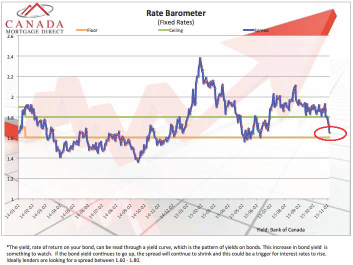
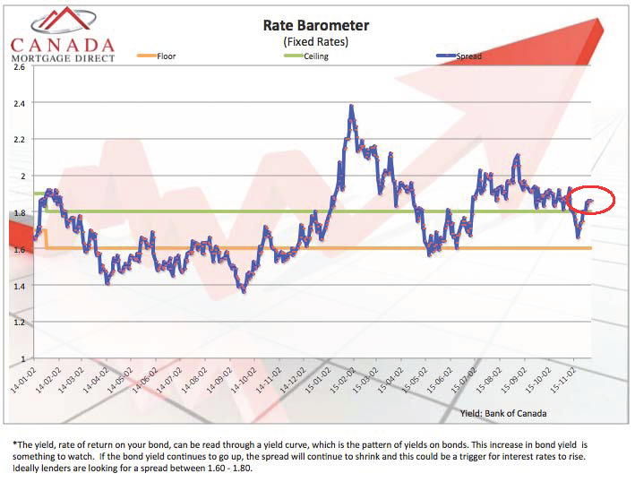
- Fixed interest rate barometer.
I think understanding this data is important to you when entering the market.
I publish this data for you to help you plan your future. If your intention is to purchase a home, I want to earn the privilege to arrange your Mortgage financing.
How To Anticipate Calgary Real Estate Pricing:
The fundamentals of supply and demand are never more true than in Real Estate (and oil as we are finding out).
The “absorption rate” and “sales to new listings” ratio are leading indicators of future listing inventory.
Other factors like price of oil, employment and net in-migration to Calgary help you anticipate demand.
Remain close to this blog as I provide another perspective to help you make sense of everything.
Sales To New Listings Ratio:
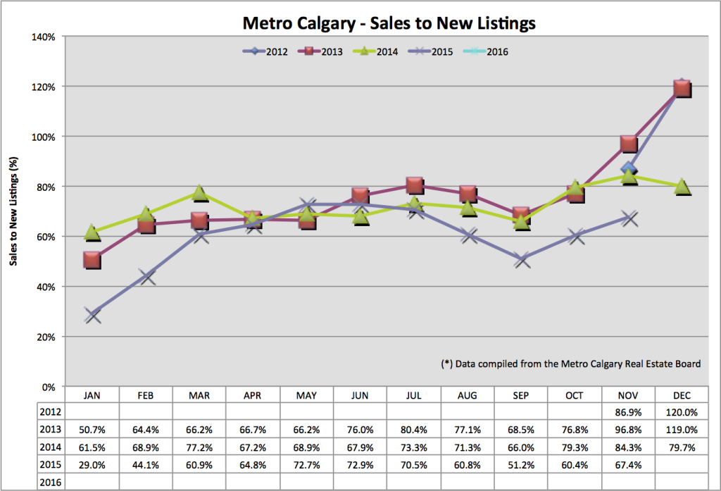
This ratio looks at how many sales there are versus how many new listings are added to the market.
A 100% ratio means there are an equal number of sales as there are listings add to the market. Any ratio less than 100% means there are more new listings added to the market than sales.
November’s sales to new listings ratio is 67%. This is a year over year decrease, indicating there are more new listings coming to market. This is a year over year increase.
 Absorption Rate:
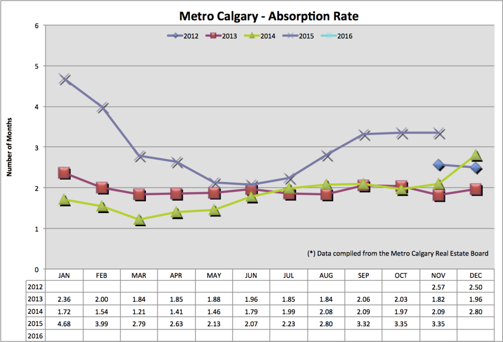
The absorption rate tells us in months, how long it would take to liquidate ALL inventory, for this particular month, at the speed of sales.
A low absorption rate tells us there is low inventory, healthy sales volume, giving sellers an advantage. This usually indicates increasing future pricing.
Just the opposite is true with a higher absorption rate. A high absorption rate tells us there is increasing inventory, lower sales volume, giving buyers an advantage.
November’s absorption rate is at 3.35 months that is significantly up from November 2014. Our absorption rate is about even over the past three months.
 Average Sales Price:
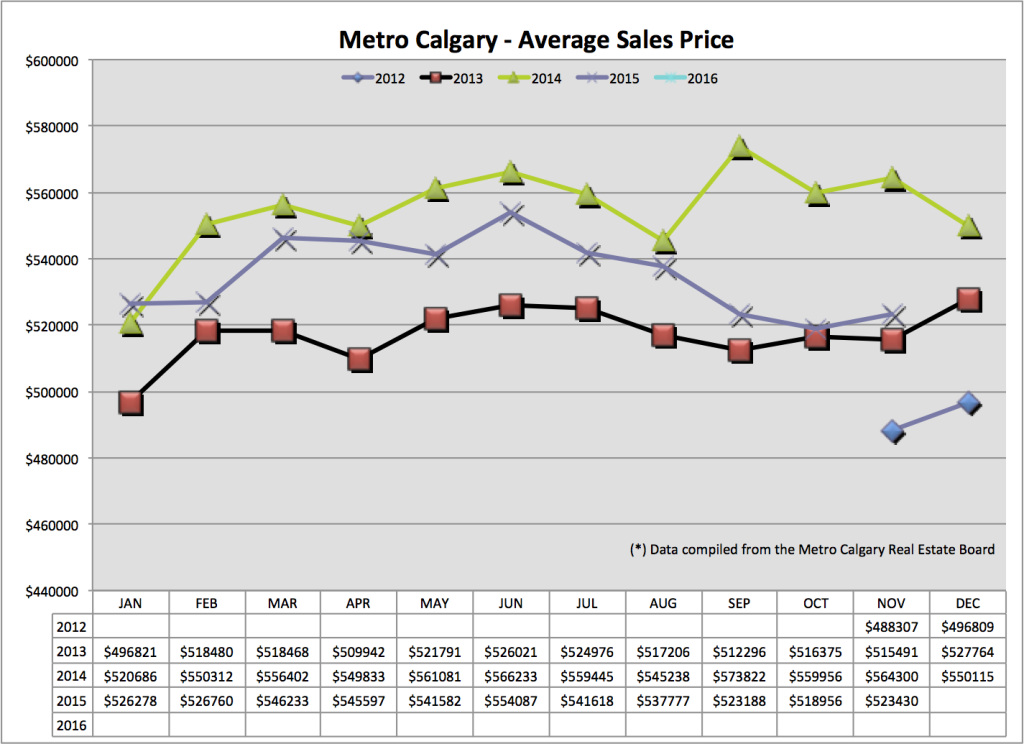
The average sales price gives us an indication of seasonal trends and comparison data. Do note, skewing data is possible with LARGE dollar sales.
We are seeing a significant year over year decrease in average price, with about a lateral move month over month. Continue to look for downward pressure on pricing.
 Fixed Interest Rate Barometer:
I’ve included TWO barometers for your interest.
The blue line in each graph is the spread the Banks make on the interest they pay out on deposits, and the interest they receive on deposits.
An indicator of increasing interest rates is a decrease in the lenders spread. A shrinking spread equals less profit. And Banks don’t like less profit.
When the blue line (spread) decreases that is an indicator of increasing interest rates. In graph #1 we see a sudden decrease in spread. We went through a period of increasing interest rates. In graph #2 we see an increase in the spread again.
Graph #2:
 If you plan on purchasing a home in 2016 – do you fully understand how much you can afford to purchase, and why?
Do you understand why you have good credit? And if you don’t, do you know how to quickly increase it?
To begin your home purchasing journey, please consider downloading my “shopping around” questions.
I want you to feel 100% comfortable with WHOM you decide to place your Mortgage with.
Thank you and talk soon,
Chad Moore
