Here’s why you want to pay attention to these numbers …
1. They help you anticipate future Real Estate home supply.
2. They cut through the media hype/spin and give you clear information to make sense of what is happening in our market.
3. This information gives you year over year and month over month comparison context.
Calgary Real Estate Board (CREB) Monthly Housing Statistics:
I track this information for YOU because I want to help you anticipate future home prices in Calgary.
This isn’t a crystal ball …but this does provide some context as to what is happening in our market today.
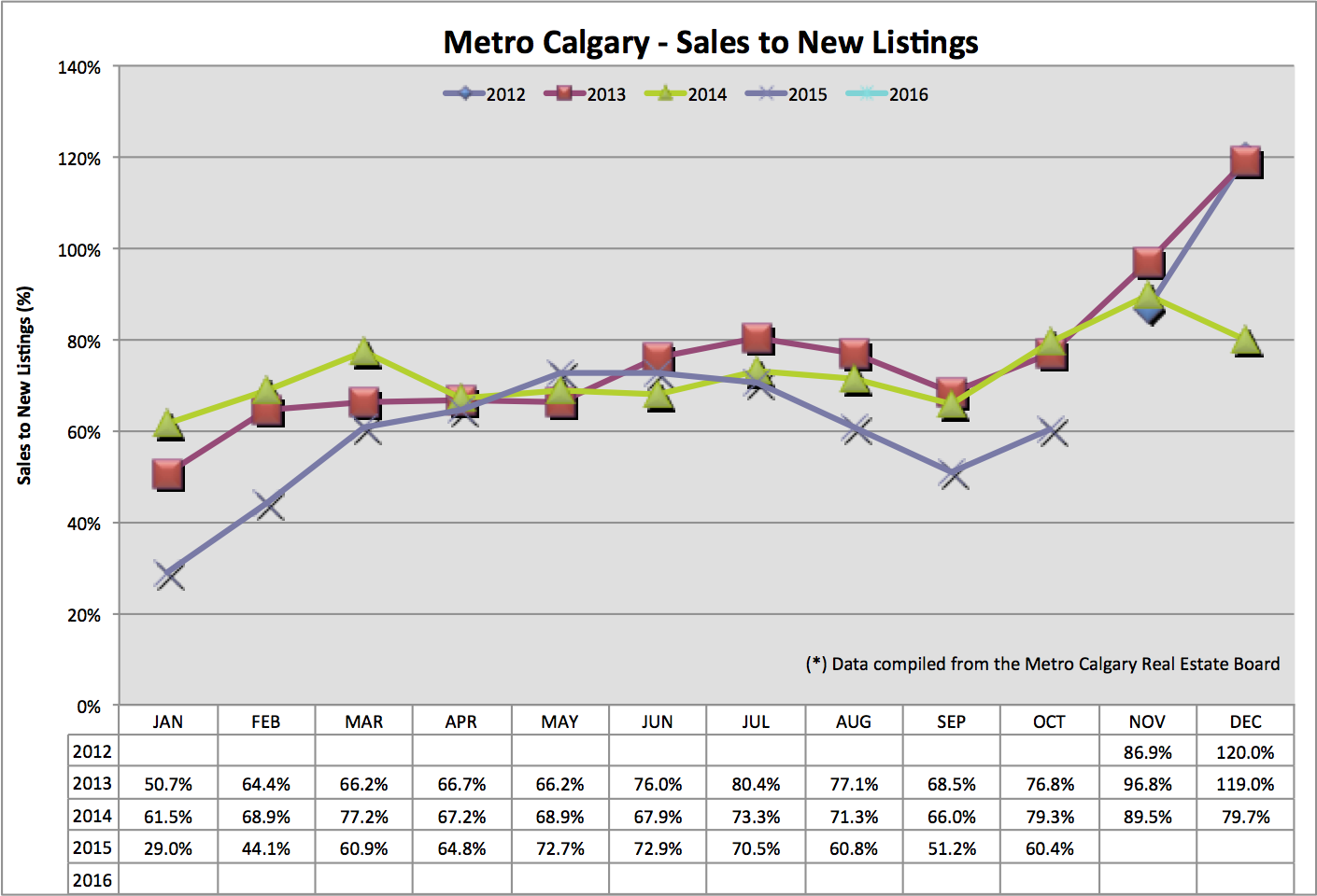
Sales To New Listings Ratio:
This is a simple ratio found by dividing the number of sales by new listings added into the market. This is one metric to help you anticipate future listing inventory in Calgary.
The laws of supply and demand are never more true than in Real Estate. We are facing demand challenges in Calgary’s re-sale home market right now with decreasing employment, primarily in our oil and gas sector.
A simultaneous increase of supply also puts additional downward pressure on home values.
Month over money this ratio is INCREASING (a good thing) but year over year, this ratio is down.
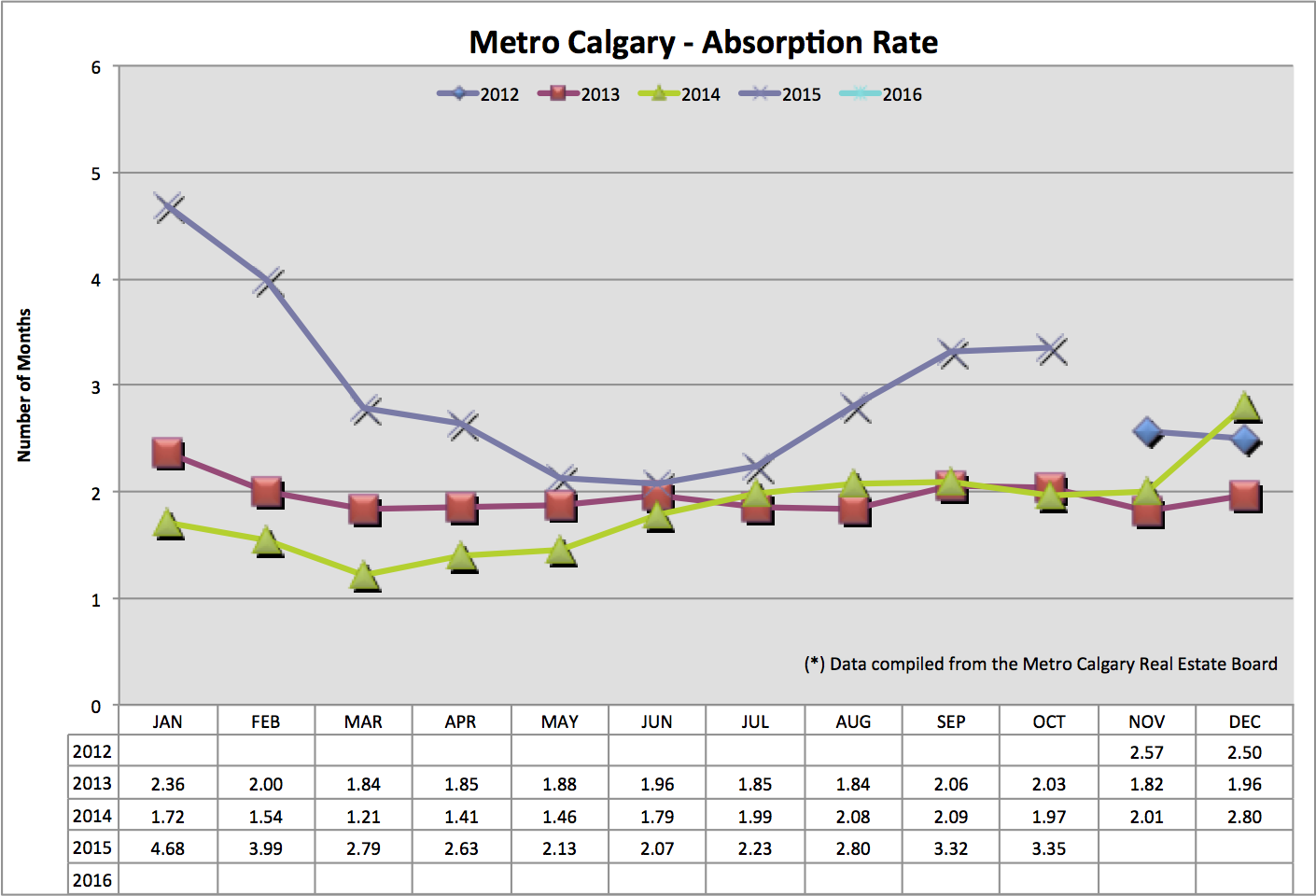
Absorption Rate:
The absorption rate tells us, in months, how long it would take to liquidate ALL of Calgary’s detached listing inventory, at the pace of current sales.
Traditionally, a balanced market is between 2-4 months.
A higher absorption rate indicates more listing inventory and decreasing sales.
You can see month over month and year over year, Calgary’s absorption rate is increasing. This helps anticipate continued downward pressure on Calgary home values.
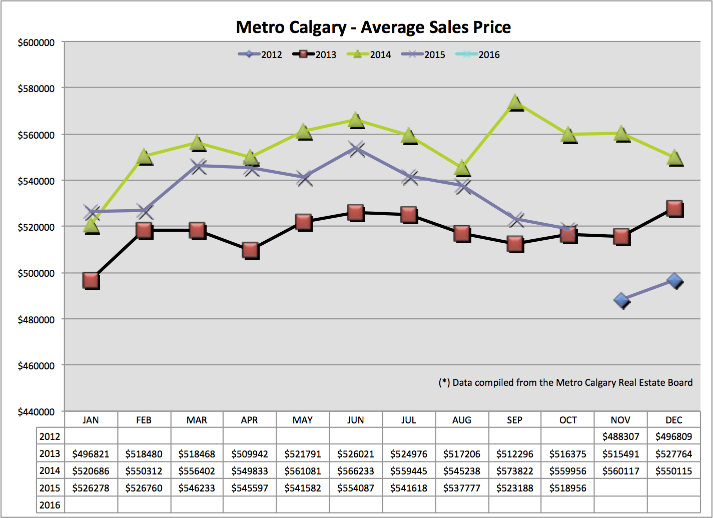
Average Home Price:
The average home price tells us where prices are today, month over month and year over year, for context on the statistics we are reviewing today.
We are seeing our average sale price continue to trend lower, almost reaching October 2013 values.
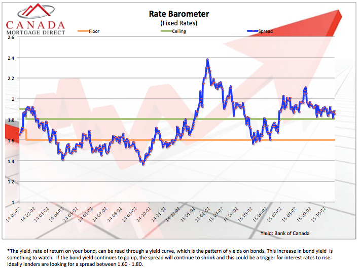
Interest Rate Barometer:
Fixed interest rates are derived from the bond market. Very basically, Mortgage lenders take money from the Bond market, pay an interest rate in exchange for this money, and re-lend that money at a higher interest rate, in the form of Mortgages.
The blue line in the graph below indicates the spread between the interest Mortgage lenders pay, and the interest they charge.
We can see the blue line is safely high enough indicating there is no pressure for fixed interest rates to rise.
Fin:
If you think this content is helpful making sense of our market today and anticipating where home values might trend, please consider sharing this content with your friends on Facebook. Thank you in advance.
Also, if you plan on watching the market closely, and think taking advantage of todays market then consider being pre-approved for a Mortgage.
Understanding this will help narrow your home search, determine what you can reasonably afford and what you’re comfortable spending each month. You also save money by securing the best deal on your Mortgage today AND over the life of your loan.
Contact me today!
Cheers,
Chad Moore